Overview
Data is a curious thing. You can have all the data on every aspect of your business in front of you in folders and files, spreadsheets and PDFs, but if it’s not well presented it can take time to understand. Reports are something we care deeply about. We want ChannelUnity to grow to become a platform not only for channel integration but also business intelligence.
Another consideration was that many shopping cart platforms already provide reporting on a variety of metrics. Often, these reports are table-based without visualisations, but still, we would be replicating existing functionality by reproducing these reports – we wanted to make something new.
And so, to begin this mission, we chose the two main metrics of business performance (excluding profit as we don’t have data on your costs readily available); Sales and Revenue. We then chose three key measures to plot these metrics against – Time, Location and Channel. Our goal was to create brilliant visual reports to illustrate each of these, showing trends immediately with concise tables of data to enable you to see behind the visualisation.
Sales / Revenue by Location
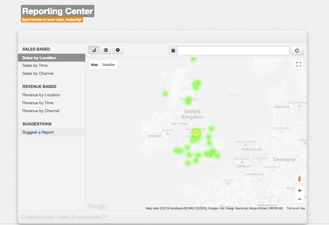
Using the GeoNames database – an open source project containing more than 2GB of geolocation co-ordinates for major towns and cities, we have been able to collate sales data into a heat map layer, which we then display on top of a desaturated Google map. Zoom in/out, and move around the map and the heat map will update. The heat map runs from green – representing areas with low sales/revenue – to red – representing the areas with the most sales/revenue.
How to use this information: This information can be highly useful when deciding where to target with geo-targeted Google Adwords campaigns or local print/television/radio campaigns. While trends in densely populated areas are to be expected, gaps within the heat map will indicate a gap within your brand awareness. The key to successful online retail is to target areas where you aren’t selling yet while ensuring areas you are selling continue to bring in sales & revenue.
But there is more to this report. Clicking the ‘Table View’ icon toolbar above the Google Map will display a table based report. This shows each location and the sales and revenue it has generated, as well as showing the total share of each. Where available, population statistics from the GeoNames database are also shown, this is used to generate a ‘Fame Percentage’.
The ‘Fame Percentage shows the percentage of a population – based on population statistics [not an exact science] – you have sold to. As the percentage grows, the chance of word-of-mouth referrals taking effect are greatly increased, with exceptionally high ‘fame’ or saturation in a town/city often leading to irradiation of the word-of-mouth effect into neighbouring towns where people travel to work or enjoy recreation activities.
How to use this information: Fame is an interesting thing which is often forgotten in todays world of social networks and online advertising, but with the rise in competition for online sellers it has never been more important. Word-Of-Mouth marketing is still one of the biggest drivers in the decision making process – if you heard that your friend got their jumper from a certain shop and like it, you’re much more likely to purchase from that shop than from just seeing the jumper in an advert.
While you can advertise on social networks and try to build a social marketing campaign, this is like blindfolding yourself and shooting a weapon at a target. You may hit the target a few times, but it will be all over the surface. Remove the blindfold, and target just one geographic area and you will more than likely find you have a longer ongoing effect and better return-on-investment.
Remember also that fame can be self-propelling – you may only need to push it to around 10% before it takes hold. When was the last time you saw a massive marketing blitz for the Costco warehouse club? You could say that this is because they have physical stores, but in some countries, they have a full e-commerce operation too.
All of this is just something to consider – your marketing efforts should always make you feel that you are growing – if you feel small one town marketing campaigns are too piecemeal, you’re going to continue to feel that even when it takes effect. But remember – targeting one location – especially one in physical reach of your business – opens up options for more promotion than you can achieve through online only advertising [ contest sponsorship, pop-up concessions, sporting team sponsorship… ]
Tying this report and its table-based variant together, we can use this information to create geo-targeted marketing campaigns where there is either a growing fame or a noticeable hole in sales on the heat map.
Sales / Revenue by Time

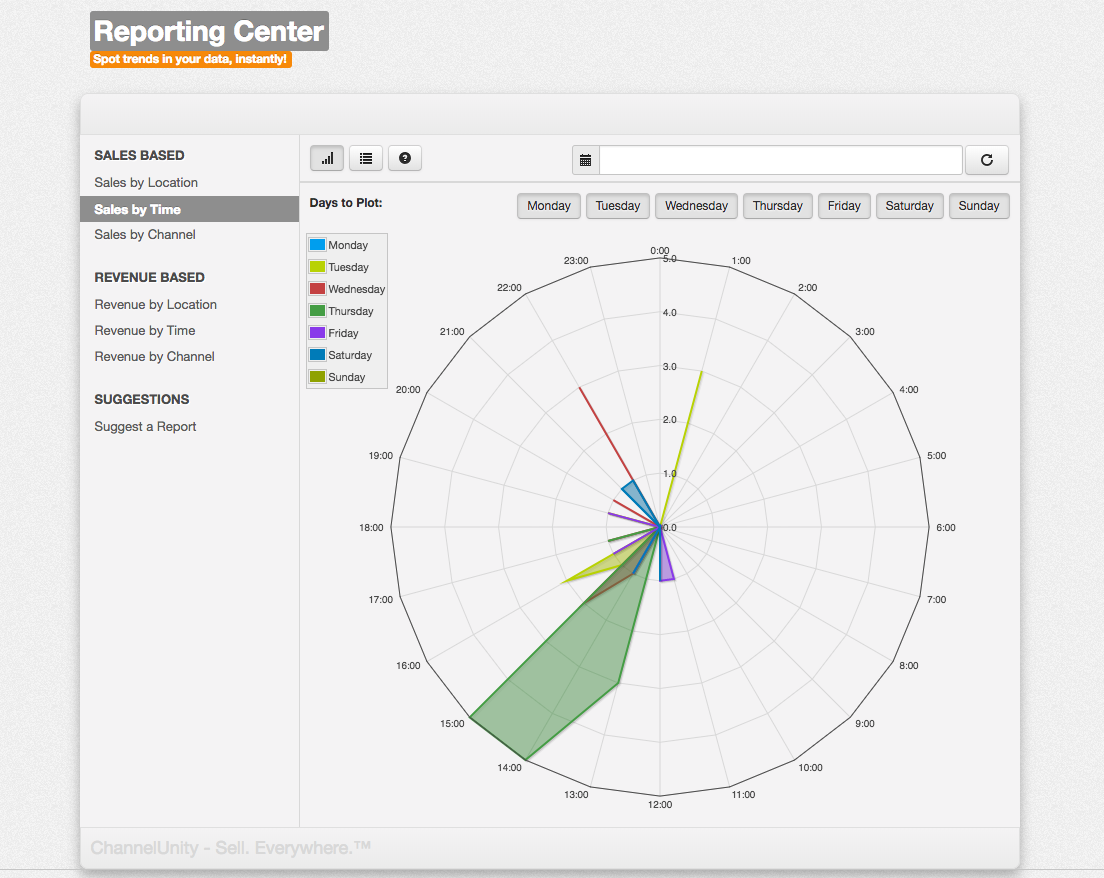
When we knew we wanted to show reports trended by time, we had to go back to the drawing board. Traditional visualisations didn’t make sense – we tried a bar chart, but this didn’t instantly make sense. So we took a ‘radar chart’ and plotted 24 spines onto it – one for each hour start of the day. With this in place, we plotted the sales and revenue data around the radar chart to create our time plot, adding in buttons to let you toggle each individual day on or off.
From this, you can see the busiest hours of the day and the quietest – traditionally you will see activity from the 3rd eighth of the chart around to the 6th; other sections are nighttime in your timezone.
How to use this information: The golden goal of online retail is a 24/7×365 order flow, and this can be achieved easily with ChannelUnity. Even now – when our platform only supports a limited amount of marketplaces, it is possible to sell into marketplaces in Asia and America almost polar extremes in time zone. Master this, and the daytime will be ending on the West Coast of the US as it is beginning in Tokyo, Japan. By days end in Japan, the day has begun in Europe.
Clicking ‘Table View’ ( icon ) will show you a table based heatmap version of the time plot report. Green indicates times of day when sales or revenue levels are low, with red indicating ‘hot’ areas of busy activity.
How to use this information: This screen can be used to see which hours of the day are busier in a less visualised, more ‘hard facts’ way as it displays the value for each hour of each day. An interesting observation here is that you may find peaks around lunchtime and early evening. This can be used to target Adwords spending to specific points within the day, or even specific days compared to others.
Sales / Revenue by Channel

Recap
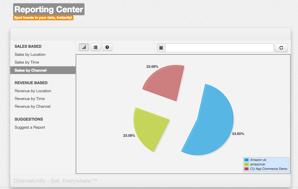
In this section, we’ve explored the useful reports ChannelUnity can generate for you. From the location reports, which can help you choose where to target your marketing, to the time based reports which help you to keep sales flowing 24/7×365 and the channel based reports which show which marketplaces are performing well and which are under performing, ChannelUnity puts a lot of useful information at your fingertips.

